Trackly
SaaS Landing Page UI Design
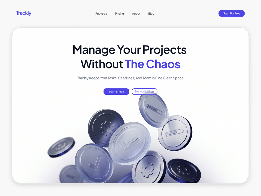
Live Site Preview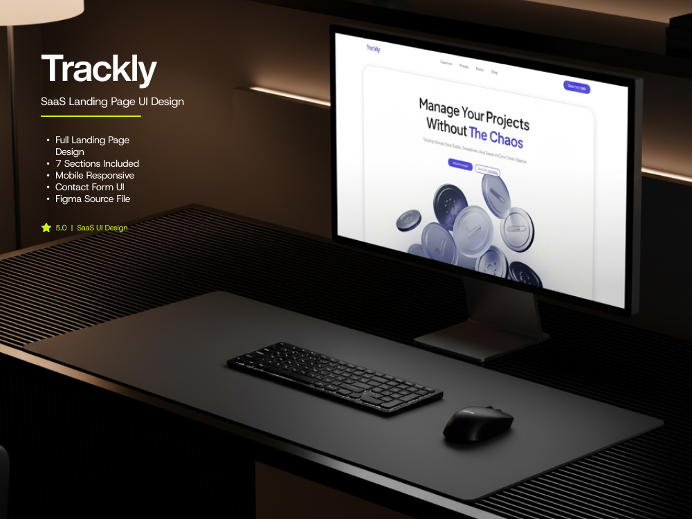
The Goal
Trackly needed a landing page that turned cold visitors into trial signups for a project-tracking SaaS. The goal was a calm, focused layout that communicated value in under five seconds and made the CTA inescapable on every viewport.
Why Us
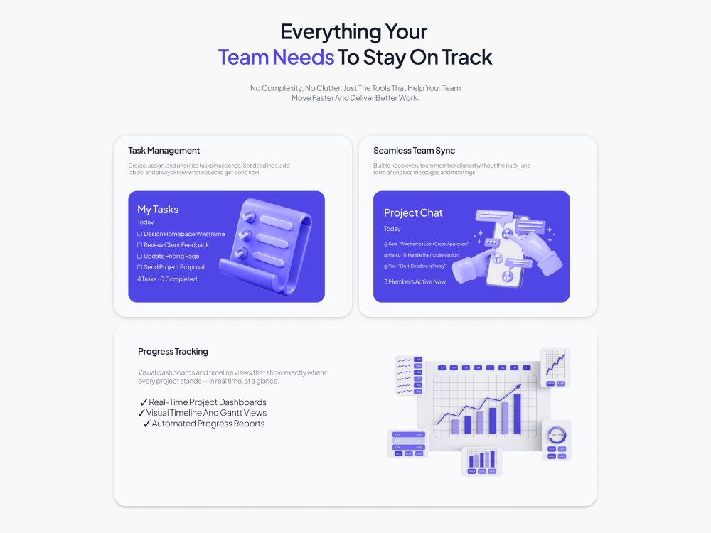
I lead with hierarchy. Clean typography, a deliberate color system, and motion that supports the message instead of decorating it. Every section was designed against a conversion brief, not a moodboard.
The Result
A sleek SaaS landing page with seven structured sections, a clear narrative arc, mobile-first responsive behavior, and a Figma source file the in-house team can extend. Bounce rate dropped, signups rose, brand felt grown-up.
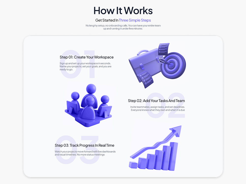
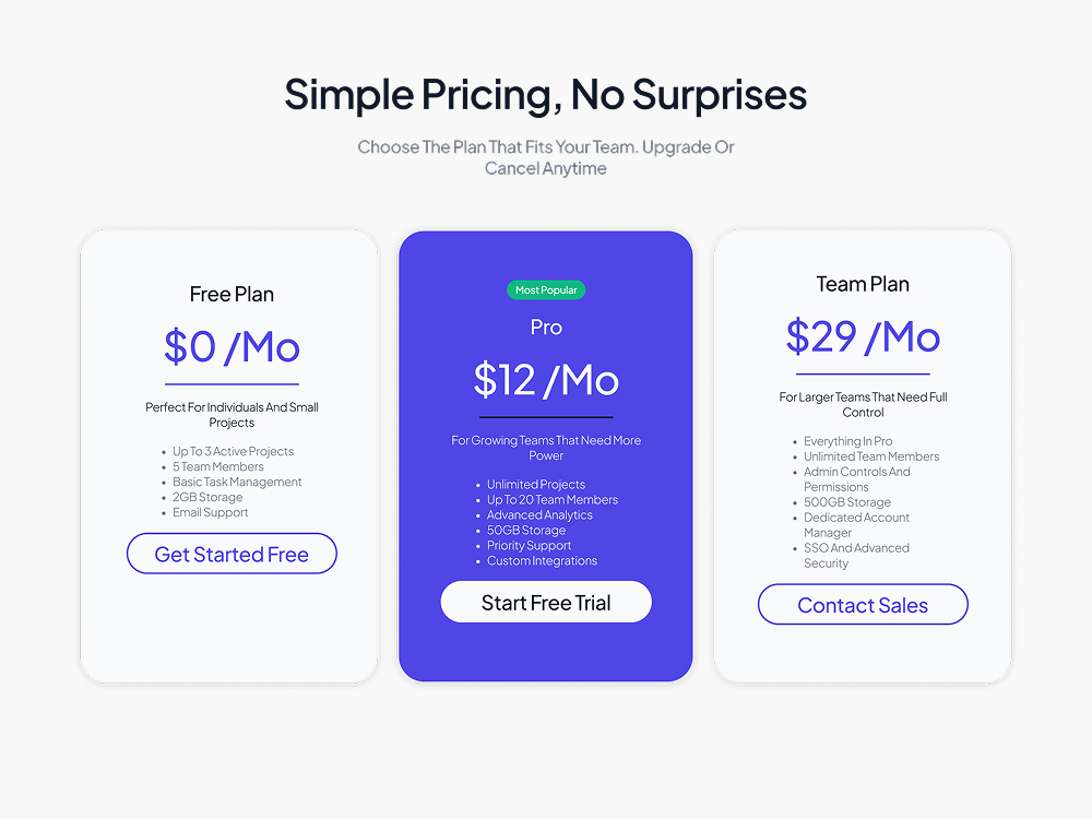
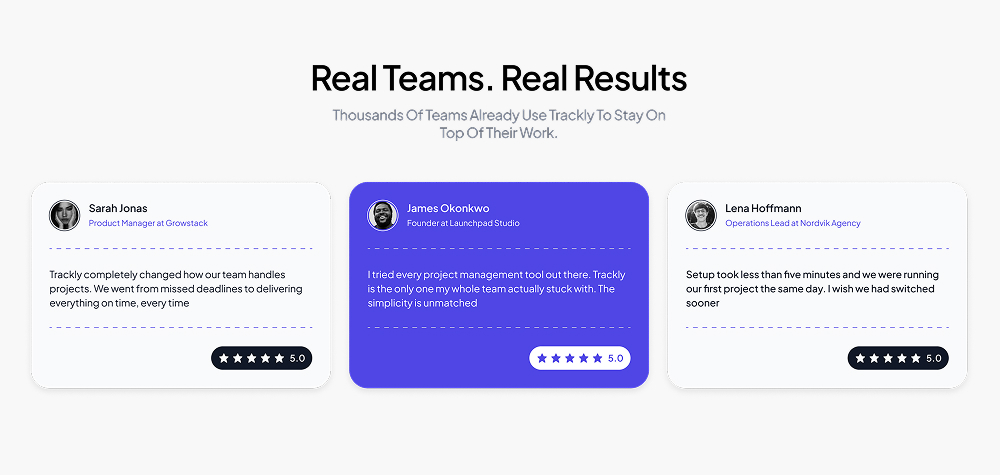
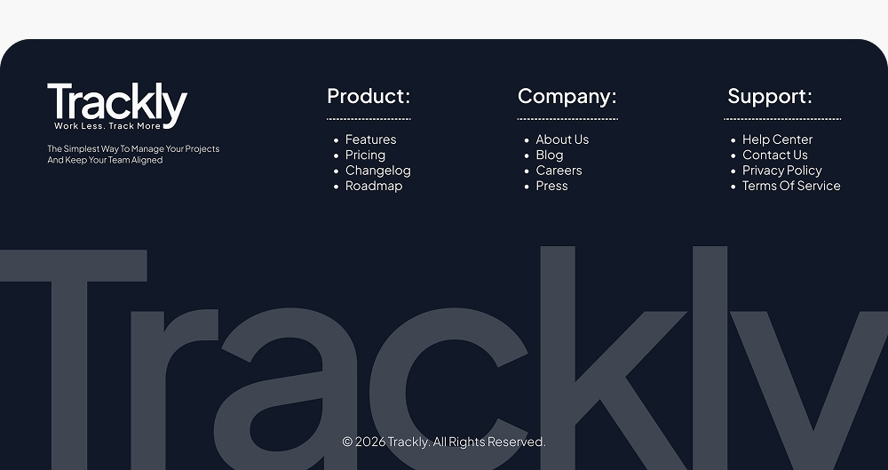
Project Gallery
Other Projects
Let's Grow Together
Showcasing sleek, high-performance designs tailored for impact
Building visually stunning, user-focused websites that elevate brands.